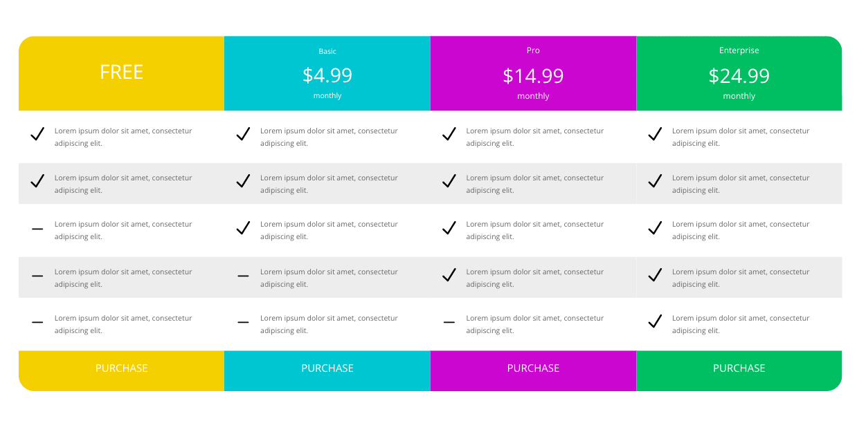
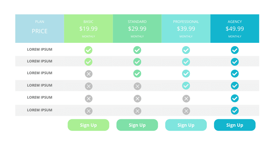
Have you ever wanted to compare your product to the standard industry product?
Need to keep the columns next to each other no matter the device screen size?
Responsive Comparison Charts answers these problems.
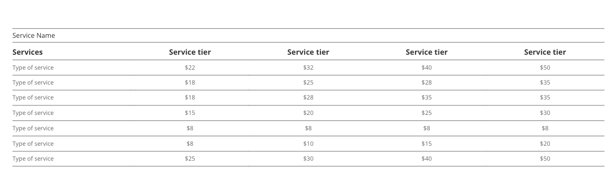
Each of these sections is built with a single column row. Resulting in cleaner html structure.
Columns stay locked together, no stacking when viewed on smaller devices. No more googling for tutorials on how to keep Divi columns next to each other in tablet and phone sizes.
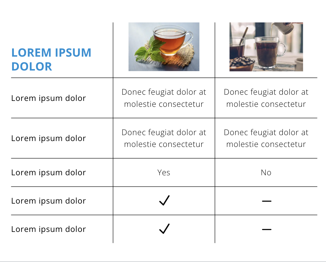
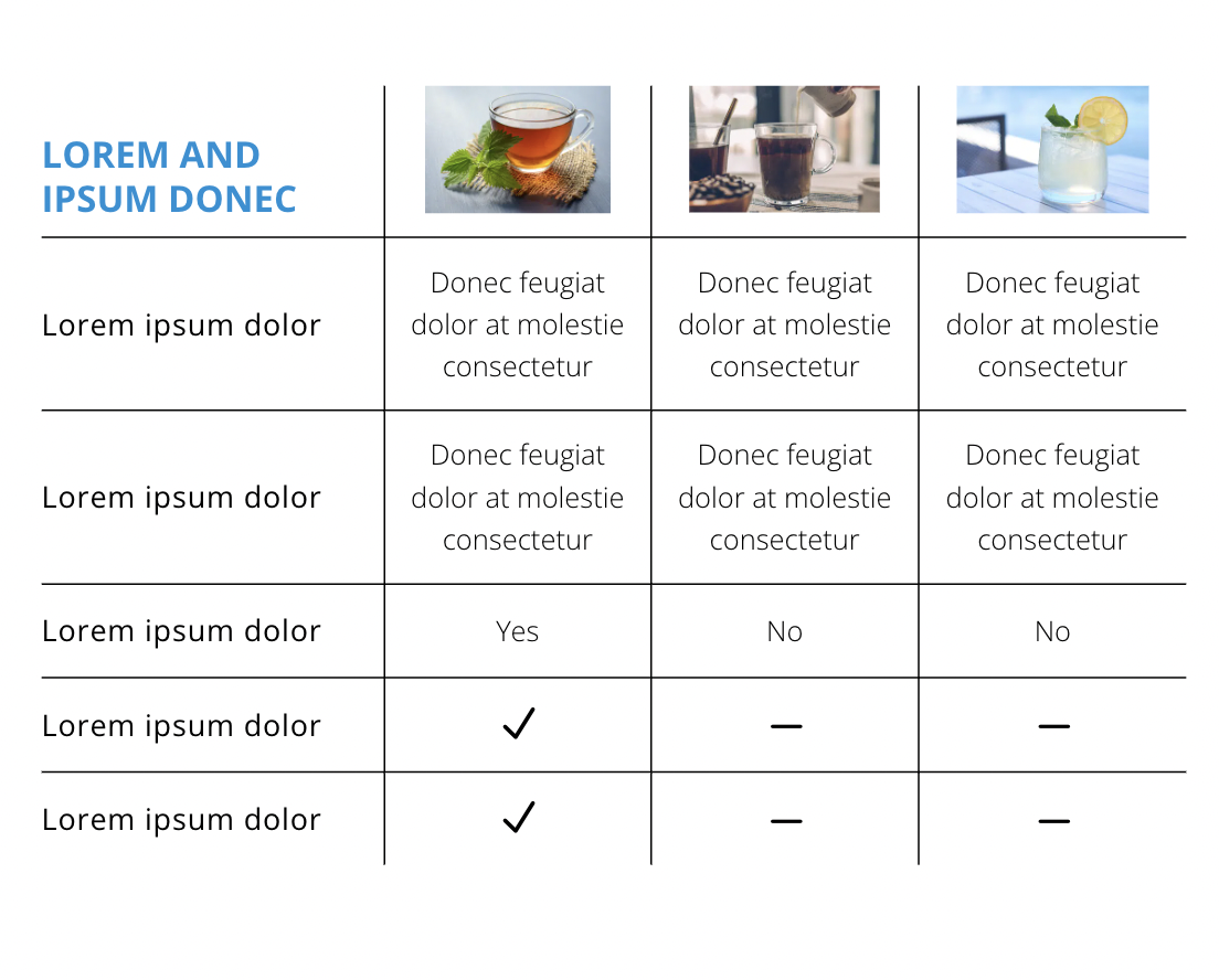
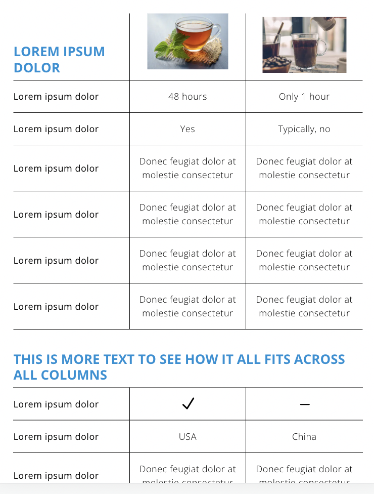
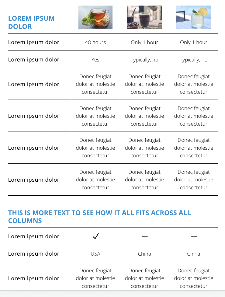
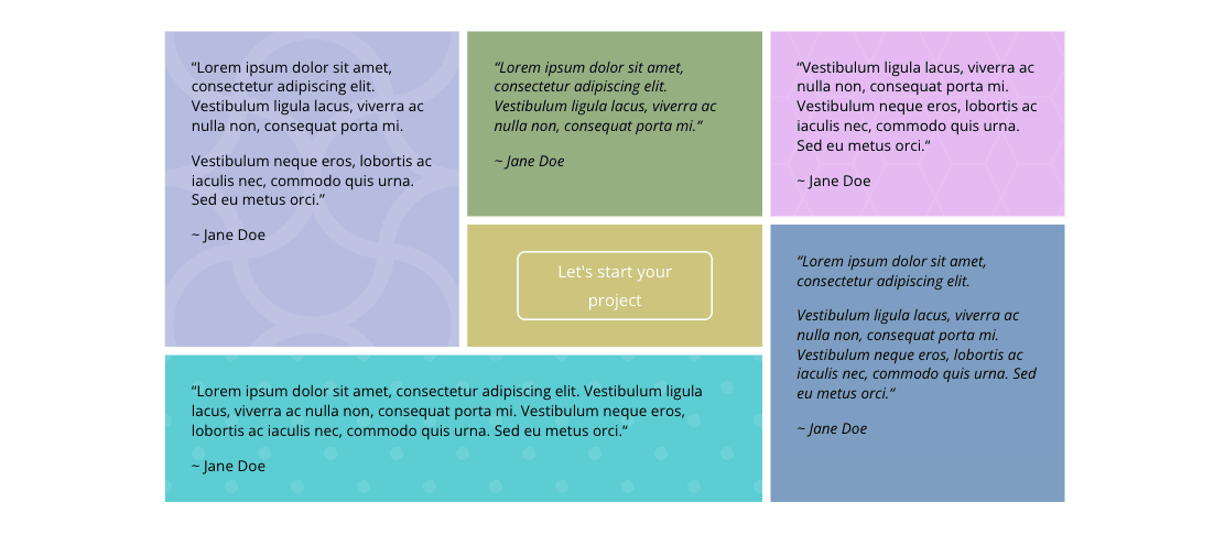
Uses native Divi text, image, and icon modules. So you can style them just as you normally would.
No need to create custom media queries.
There are a total of 10 section available with this product. You can use all of them or just one that fits your need.

License Key
None needed for this product.
Customer Support
All Cymatics, Inc. products include customer support for up to one year of your purchase date.
Subscription Terms
These layouts are unlimited use for life.
Documentation
Our product documentation will walk you through set up, as well as explain all the major features.
Download of this product contains placeholder images. You can find the demo image links in the license.txt file of your downloaded folder.
*Divi is required for these Responsive Comparison Charts to work. Make sure you are running the Divi theme. You can also have a child theme in place, just make sure the parent theme is Divi.