Responsive Comparison Chart Documentation
Please read and refer to this documentation when you are installing and customizing the Responsive Comparison Charts and My Favorite Things Chart.
Installation
RCC layouts need to be installed into your Divi Library before they can be added to your pages or posts.
1. Uncompress the downloaded zip folder from your purchase.
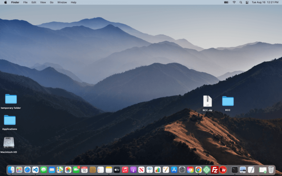
2. Open the uncompressed folder to find the license.txt file and the Responsive Comparison Chart .json file.
3. Please read the license.txt file as it will include the GPL license information along with 3rd party media credits.
*This product does not include the photos as you see in the demo due to copyright issues. You will be replacing these images with your own, anyway. But it’s a good idea to make sure you have full copyright privileges to any images/media you end up using on your website.
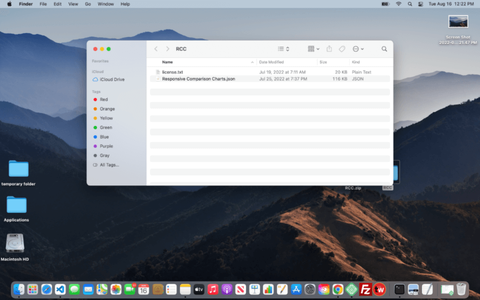
4. Login or go to your website dashboard.
*Divi is required for these Responsive Comparison Charts to work. Make sure you are running the Divi theme. You can also have a child theme in place, just make sure the parent theme is Divi.
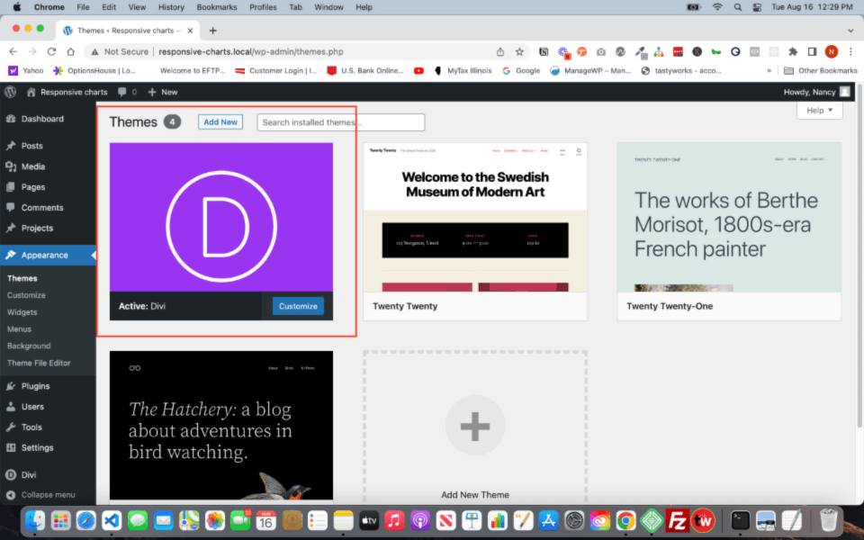
5. Go to the Divi Library
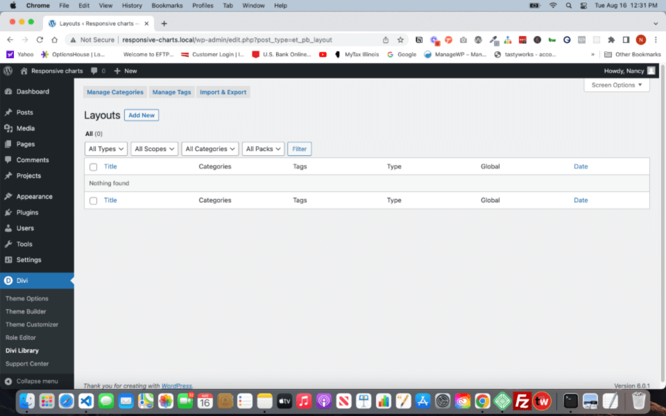
6. Click on the Import & Export blue button
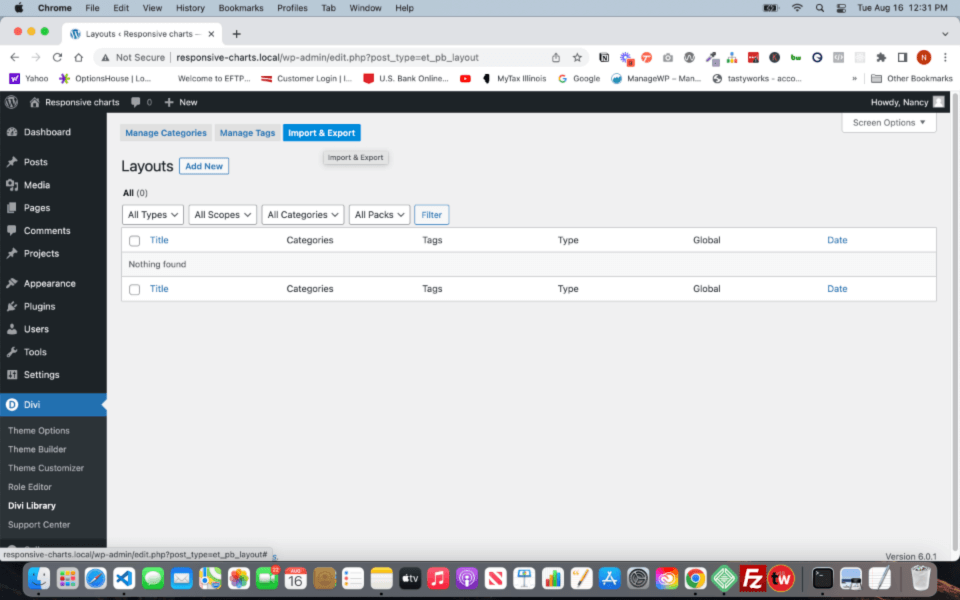
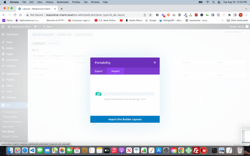
7. Modal pops up
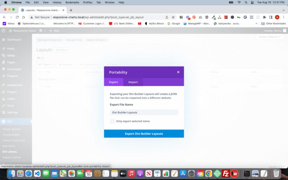
8. Click the purple Import tab and either drag/drop the Responsive Comparison Charts.json. Or click the Choose File.
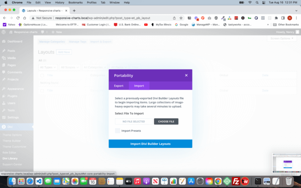
9. Your selected file will be added into the Import modal. Leave the Import Presets box blank (un-ticked).
There are no presets in these charts. You can make your own presets later if you wish. Click the blue bar at the bottom of the modal, Import Divi Builder Layouts button to begin the import.
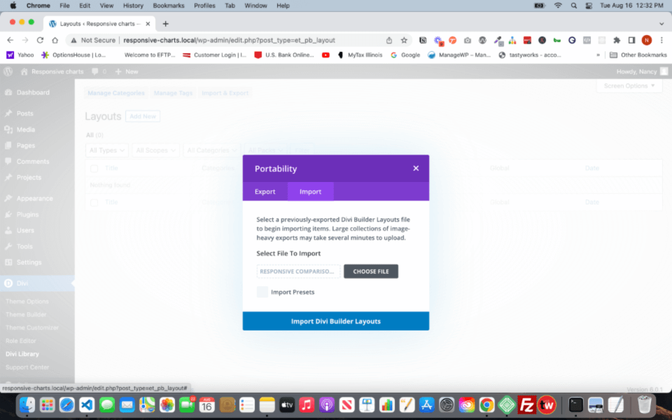
10. Click the blue bar at the bottom of the modal, Import Divi Builder Layouts button to begin the import.
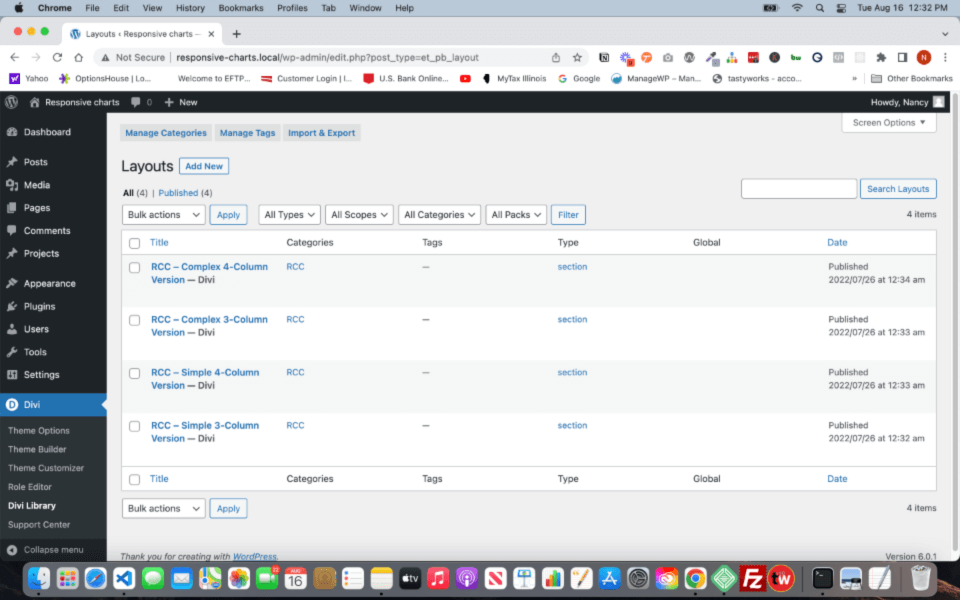
RCC – Complex 4-column Version
RCC – Complex 3-column Version
RCC – Simple 4-column Version
RCC – Simple 3-column Version
RCC – My Favorite Things
RCC – Seating-style
RCC – Pricing Chart 1
RCC – Pricing Chart 2
RCC – Pricing Chart 3
RCC – Testimonial & CTA section
If you don’t see these new sections in your Library, then the import did not work.
If you have a lot of content/layouts saved in your Library, either run a search or scan your Library for these sections, they’ll probably be alphabetized so buried in the pages of your Library.
Adding Chart Sections to your page
1. Go to Pages and select your page, and Edit with Divi.
*For demonstration, I selected Elegant Theme’s Divi Essential Oils layout.
2. Click the blue button on the page where you want to add one of the Comparison Charts.
3. Click Add from Library
*The RCC sections will come up (along with any other sections you have saved in your Library).
4. Click/Select on the Version of chart you wish to use. You can use multiple charts on the same page, it depends on your content and design aesthetic.
5. Click on Use This Section
6. The section with the chart will load onto your page.
Customizing the Charts
Font family:
All of the text modules in the charts are set to default. So if you set the font-family in the Theme Customizer > General > Typography > Header & Body font-family, the text modules in the charts will pick up on those selections.
Font color:
The H3 text is set to a blue color out of the box. Simply change the color of the text in the module that fits your branding.
Font size:
We’ve set the font size in each of the modules for desktop, tablet, and phone. You can change this to whatever sizing you desire that fits with your font family and overall space you give to the row. To speed up the update to your font sizes, create a preset and apply it to each of the text modules that need the new font size.
Images:
Set your product images to the same height. I’ve set the height of the images on the charts at 250px.
Depending on your images, you may need to play with them to get them to fit and align correctly.
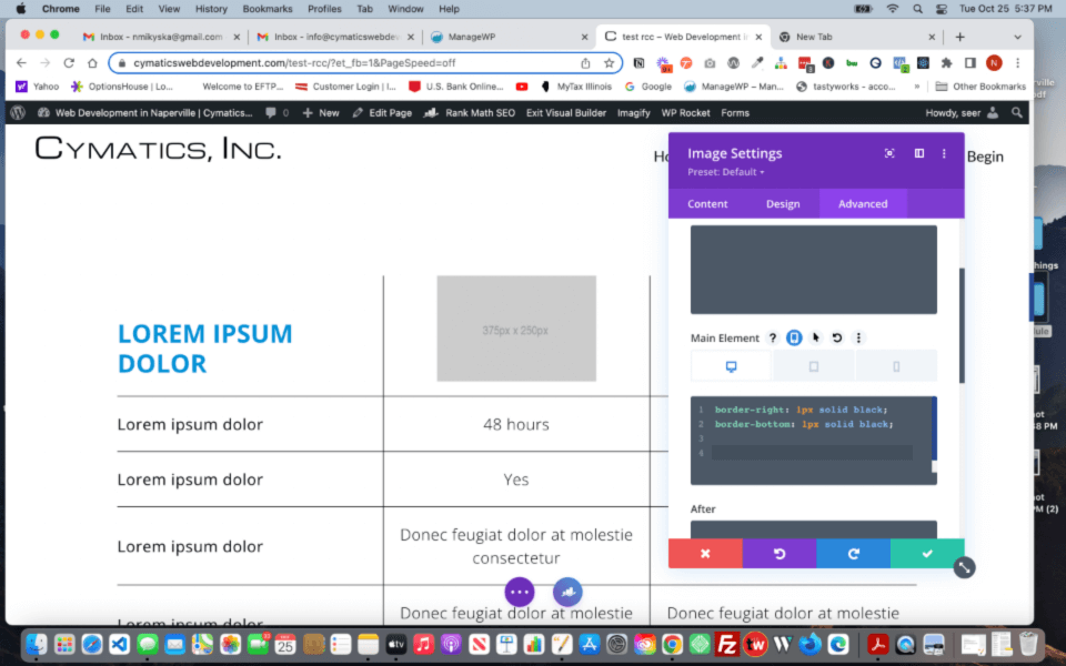
The border lines are written in the Advanced tab > Custom CSS > Main Element. This is because the Border selection in the Design tab will display the lines along the edge of your image, not the edge of the grid cell. Which would break the alignment of the lines to the surrounding modules.
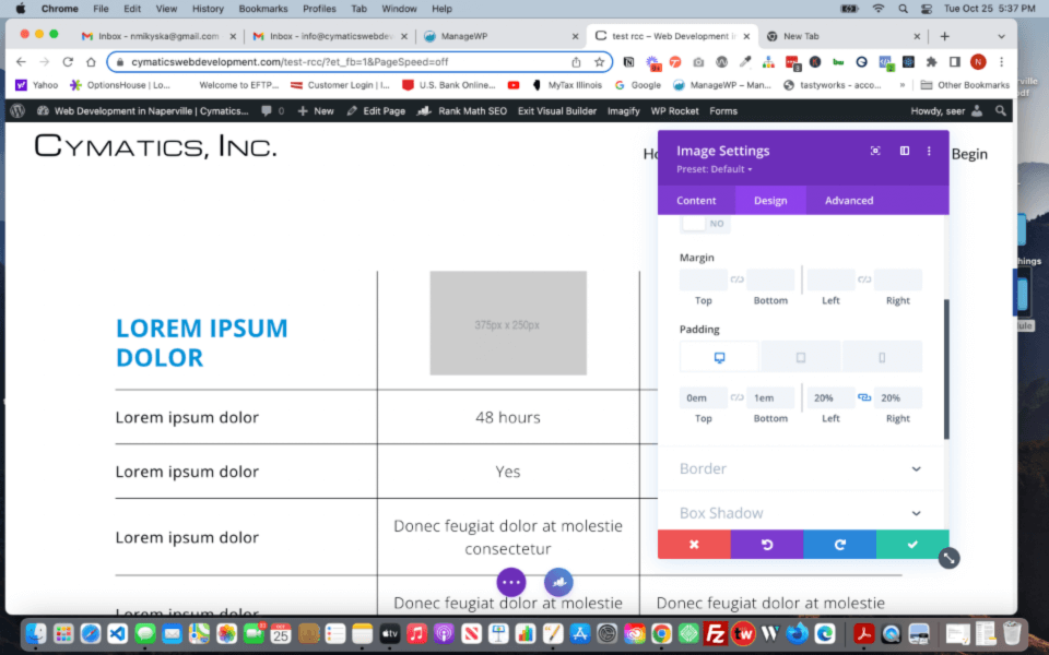
In the Design tab:
Sizing:
Set the width to 100%. You want the image to take up the entire width of the grid cell.
Spacing:
Turn off the add space under the image. Padding: add a 1em to the padding-bottom so that the image doesn’t rest along the border bottom. The design of these charts has an airy feel to them. Then on padding left and right, for desktop, I’ve set these to 20%. Again, depending on your images, this can be adjusted. Some images might be png’s where you have a transparent background to your product. Or you might have jpeg’s where there is a background image/color to your product. Adjust the padding left and right to how you’d like the alignment within the grid cell.
If you want to add border lines along the top and outer edges of the chart, you can. For the image modules, add padding -top of 1em, in this case, to give an equal amount of space on top as it is at the bottom. And add border-top: 1px solid black; in the Advanced tab > custom css> main element.
Content:
Just add your content in the text modules that you need. The far left column are your Comparison Criteria for your product or service. Going across the row, the second, third, fourth columns are for how each of the product/service match up in that Comparison Criteria.
Icon modules:
We added icon modules to give you a choice of using words(text) for each product detail, and using an icon. The icon module includes custom css in the Advanced tab.
It is important to have the min-width: 100%. This is so that on tablet and phone, the border lines extend to the edges of the grid cell so they line up with the other borders in surrounding modules.
You’ll note the border declarations are also in the advanced tab, too. Like in the images modules, if you use the border selection in the Design tab, it will add borders to the outside edge of the icon.
Display flex, align, and justify code is to center the icon in the middle of the grid cell horizontally and vertically.
Spanned Text H3 Module:
This text module is an H3 and is good for longer text to split up the chart into different parts. In the Advanced tab> Custom CSS> Main Element you will see another grid declaration. With a grid-column: 1/4; or a 1/5(for 4column charts). This declaration lets the content of this module to spread across all of the columns in the main grid.
You can push the text to only go half-way across by adding padding-right: 50%; either in the Advanced Tab > custom CSS> Main element adding it to the existing css code. Or by going to the Design tab > Spacing > padding-right and enter 50%. Or whatever percentage you’d like the text to be pushed.
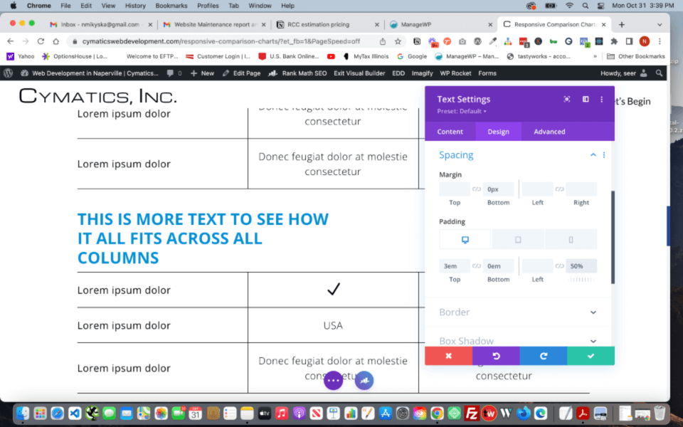
Understanding Grid
If you go to the Row > Column > Advanced Tab > Custom CSS > Main here you will see the CSS Grid declarations. This controls how the modules line up across the page for desktop, tablet, and phone. Do not delete this code or all of the modules will lose their placement and will come down in a single column down the page. You can set the width of each of the columns if you need to. The width is controlled by the grid-template-columns line. The percentages are for each column going from left to right. So you can change the first column to be 40%, the second column and third column then should be 30%. Adding each of these percentages equals to 100%. This is 100% of the available space within the row width. You can set the row width to be 90% or 95% and max-width at 100% if you need to. CSS Grid is wholly flexible including down to phone sizes. The Grid will maintain the column structure no matter how wide the device.
The important thing to keep in mind is to not delete the display: grid and the grid-column: 1/4; from the Advanced Tab. If you do, the main grid will shift the content into the far left column cell. All of the other modules below (under) will then shift to fill the next cells on the same row, thus breaking the overall look of the chart.
To delete rows:
Once you have entered in your content and find that you have extra rows that you don’t need, simply delete the modules. You may need to adjust the borders of the modules you are keeping. If you are using the 3 column grid you will delete 3 text modules. The 4 column grid, delete 4 text modules. Check the Naming Conventions documentation to help you navigate which modules you want to delete.
To add rows:
Duplicate one of the existing modules and the Grid will automatically put it in the next row and cell for you. You may need to move modules around to get the order you need. You may find it easier to add modules in the Wireframe view. If using the 3 column chart, you will need 3 additional modules to fill the next row. The 4 column chart, you will need 4 modules to complete the next row.
Wireframe View:
It looks daunting at first, but there is a method and structure to the chart. Always remember the Grid rules in the column of the row is setting the columns of the chart. So in wireframe, it will simply have a section, a single column row inside it, and a series of modules within the row.
Naming Conventions
You will see in the wireframe view and in the admin label of the section/row/modules that I’ve added some naming conventions to help you navigate the chart and the grid.
Each module begins with the Row number the module fits. Then is the Column the module sits within the row. For the blue H3 text modules I’ve named them as Cymatics-chart-title blue and top row.
So for the very 1st text module on the far left top corner of the chart is Row 1 Column 1. This is where the grid columns all start.
If using the 3-column chart, there will be 3 columns. 4-column chart…there will be 4 columns.
The grid runs from left to right, top to bottom.
Top row of the chart is the H3 text module, then the image modules for columns 2, 3, or 4.
The 2nd column are all text modules. The far left (1st column) is the criteria comparison text. Then your product 1 detail text, followed by product 2 detail text. And so on.
If using the Complex chart with the H3 text that runs across all of the columns, I’ve named it, for example, Row 8 Col 1-Col3. Cym-chart-title blue text SPAN across all columns. Because this is spanning across all of the columns, the next module starts Row 9 and you’re back to your 3 or 4 column structure of the Grid.
My Favorite Things Chart
This is made with CSS Grid also, The single row column holds the grid column instructions like all the other charts.
The name text module (blue background) is set as a SPAN across all the rows of the grid (this is column 1 of the chart).
You can add or delete rows from this chart. See How to Add Rows to My Favorite Things Chart.
The 2nd column of the Grid (Color, Season, Books, Movies Hobbies, etc) are all labels as ‘criteria’ along with the row and column #’s and the text in the content of the module.
The 3rd column of the Grid (the answers to the criteria) are all labelled with ‘detail’ along with their Row and Column #’s and the criteria content it corresponds to.
How to add a row:
It’s easier to add a row in the Wireframe view.
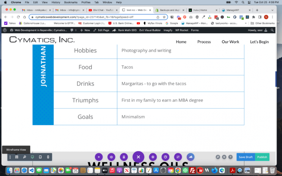
Step 2: Duplicate the Criteria text module.
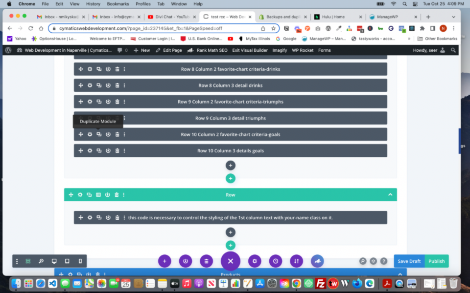
Step 3: Duplicate the Details text module.
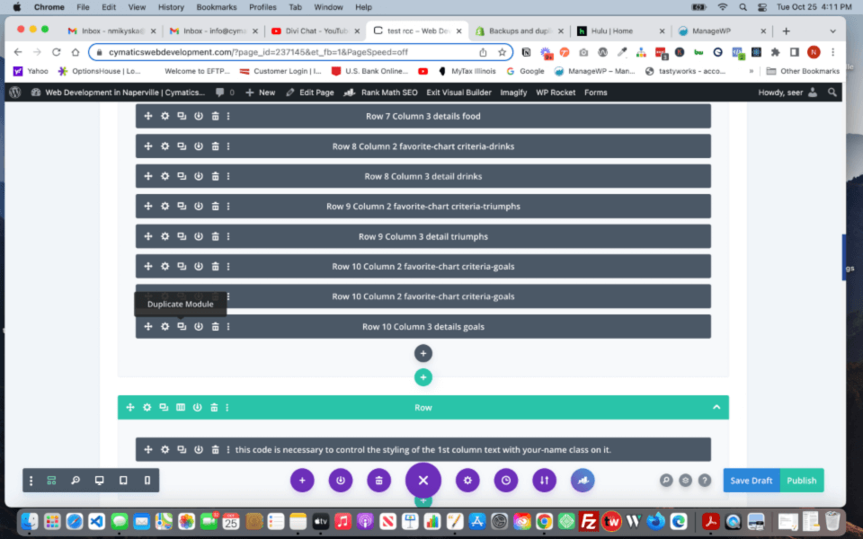
Step 4: Drag the new text modules into order.
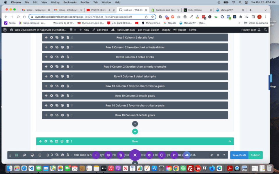
Step 5: Change the Admin Labels on the new text modules for future reference.
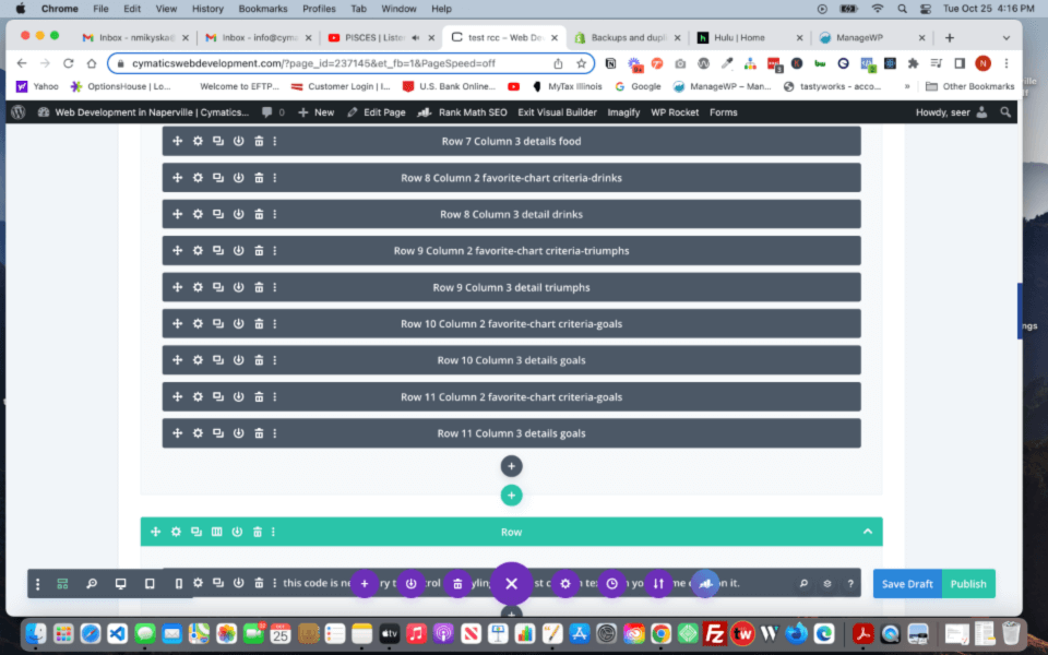
Step 6: Go back to Desktop View of the visual builder. As you will see, the name column doesn’t extend down to the new row. Go to step 7.
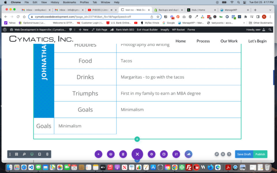
Step 7: Click the gear icon on the 1st text module of the grid. The text module that contains the persons name.
Step 8: Go to the Advanced tab and into the Custom CSS > Main Element.
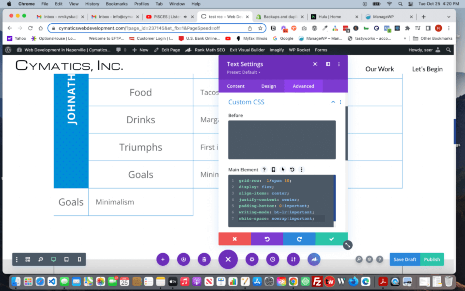
Step 9: On line 1, change the number 10 to 11 of the grid-row. Save. The text module with the persons name now aligns with the new row and the new text modules have shifted over into their correct columns.
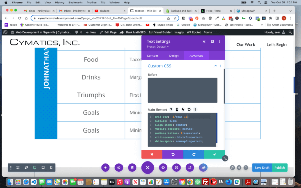
Step 10: Go ahead and modify the text content of each text module for your individual needs. Be sure to save before exiting.
Subtracting a row is the same way as adding a row. Just delete the text modules that you don’t want and change the grid-row number in the persons name text module.
Required Code Module – just for the My Favorite Things Chart
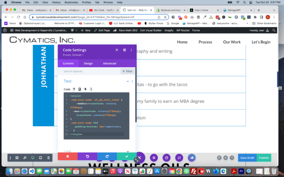
This blue name text module also relies on the code module tucked at the bottom of the section in its own row. The class .your-name is set on the text module and is styled here in the code module.
This is needed because trying to run the text vertically within the text module by itself turns the entire module when we only want the text inside the module to turn.
The blue color is set in the text module as background-color and I added a polka-dot pattern on top of it. You can add a background-image instead or a gradient…it’s up to you. The background is part of the text module; not the column made by the Grid.
Seating-style chart
For tablet, the columns are set to be 4 across. For the last 2 groups, the text modules have specific grid-column settings so that groups 13 and 14 are centered. Phone all of the groups are set in 2 columns across.
Pricing chart 1
Includes a code module in its own row. This controls the padding of the description text and the icon. Make sure you have this code module when you add this section to your pages.
Pricing chart 2
This design was inspired by my own hairdresser. She has various services for hair care. From cuts, perms, fringe, and styling. Each of these services have their own pricing based on how long the hair is. The longer the hair, the more expensive it is.
Pricing chart 3
The sign up ‘buttons’ are actually text modules designed to look like buttons. And they are set in the grid individually so there is the black cell in column 1.
Testimonial & CTA section
The overall grid is set to 3 columns, then 2, then 1 for desktop. Tablet, and phone. The spanned text modules are set in the advanced css settings of the individual text modules.
Golden Rule
Just keep in mind, the grid creates the columns for you. They run from the far left to the far right across the page/screen from top to bottom.
FAQ’s
The lines are missing
We found the issue is due to either cache or the optimization plugin needed to be dialed back.